The frustrating blurriness on your 4K monitor isn’t a fault; it’s a direct result of a clash between Apple’s “Retina” high-pixel-density philosophy and the standard resolution of most external displays.
- macOS is optimised for two pixel densities: ~110 PPI (non-Retina) or ~220 PPI (Retina). Most 4K monitors fall in a ~160 PPI “no-man’s land” that forces compromised image scaling.
- Features designed for casual use, like True Tone, actively sabotage colour-critical work by prioritising environmental adaptation over a consistent digital standard.
Recommendation: To achieve sharpness, either invest in a ~220 PPI “Retina” class monitor (5K or higher at 27″) or use specialised software to force the correct HiDPI rendering modes on your existing 4K display.
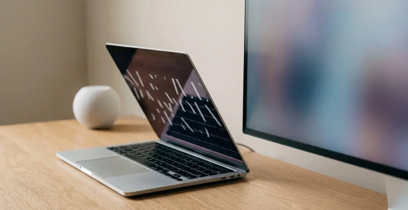
If you’ve connected a pristine 4K external monitor to your MacBook only to be disappointed by text that looks slightly soft or fuzzy, you are not alone. It’s a common frustration for designers, developers, and photographers who expect pixel-perfect clarity across their entire workflow. The immediate assumption is that the monitor is faulty or that there’s a simple setting to fix it. Many users will advise you to just “buy a 5K display” or endlessly tinker with resolution settings, but these suggestions miss the fundamental issue.
The problem isn’t a simple bug or a resolution mismatch in the traditional sense. It stems from a deep-seated philosophical and technical decision within macOS itself: the “Retina” display standard. Apple designs its software to look best at two specific pixel densities. When a display, like most 27-inch 4K monitors, falls outside these optimised zones, macOS is forced to use a rendering compromise that results in that subtle but noticeable lack of sharpness. This isn’t just about resolution; it’s about the very mathematics of how pixels are drawn on screen.
But what if the key to solving this wasn’t just about finding the right monitor, but about understanding the core principles of Apple’s display technology? This article goes beyond the superficial fixes. We will deconstruct why your MacBook’s native display looks so sharp, why most external monitors struggle to keep up, and how you can take back control to ensure your visual work is both crisp and colour-accurate, whether you’re on the internal display or a sprawling external one.
This guide will explore the technical reasons behind display scaling, the critical settings you must disable for professional work, and the strategies used by experts to achieve a flawless visual workflow across multiple screens. Below is a summary of the key topics we will cover to help you master your displays.
Summary: Mastering Your MacBook and External Display Workflow
- Why Does Native Resolution Look Tiny While Scaled Looks Slightly Blurry?
- How to Profile Your MacBook Display for Print-Accurate Colour Work?
- 120Hz ProMotion or Standard Retina: Which Matters for Graphic Design Work?
- The True Tone Setting That Causes Colour Errors in Photo Editing
- When Does Adding an External Display Improve or Degrade Your Workflow?
- Why Does 120Hz Scrolling Feel “Faster” Even Though Content Loads Identically?
- The Display Calibration Mistake That Ruins Colour Work Done on Location
- Does Your Phone Actually Need 120Hz or Is 60Hz Perfectly Fine?
Why Does Native Resolution Look Tiny While Scaled Looks Slightly Blurry?
The core of this issue lies in a concept called pixel density, measured in Pixels Per Inch (PPI). Apple’s Retina displays are engineered to a very high density, typically 218 PPI or higher. At this density, individual pixels become imperceptible to the human eye at a normal viewing distance, creating the illusion of a printed page. macOS achieves this by using a technique called integer scaling. It renders the user interface at double the size (e.g., a 2×2 block of physical pixels is used to create one virtual point) and then displays it on the HiDPI screen. This results in perfectly sharp text and UI elements.
The problem arises when you connect an external monitor that doesn’t meet this specific density. A typical 27-inch 4K monitor has a PPI of around 163. This is too dense to use without scaling (native resolution makes everything tiny), but not dense enough for perfect 2x integer scaling. To compensate, macOS uses fractional scaling. It renders the interface at a much higher resolution internally and then mathematically scales it down to fit your monitor’s native resolution. This process involves interpolating pixels, which is what introduces the slight blurriness and lack of crispness you see, especially on text.
Essentially, your MacBook isn’t showing you the monitor’s native pixels directly; it’s showing you a pre-rendered, scaled-down image. While this maximises compatibility, it sacrifices the pixel-perfect sharpness that integer scaling provides. You are caught between an interface that is too small at native resolution or one that is slightly soft when scaled to a usable size. This is the fundamental trade-off when using a non-Retina-class monitor with a Mac.
How to Profile Your MacBook Display for Print-Accurate Colour Work?
Achieving colour accuracy, especially for print, requires moving beyond subjective visual adjustments and embracing a data-driven approach. The goal is to make your display conform to an industry standard so that what you see on screen is a reliable predictor of the final printed output. While professional workflows demand a hardware colorimeter (like a Calibrite or SpyderX), you can establish a crucial baseline using macOS’s built-in tools. This process is called creating a colour profile.
Before you begin, your environment must be controlled. Avoid direct sunlight or strong, coloured lights, as this will contaminate your perception of colour. The first step in a professional calibration is to aim for a specific target. For most print and graphic arts work, the targets recommended by industry experts for print-accurate work are a D65 white point (simulating daylight), a gamma of 2.2, and a luminance of 100-120 cd/m² (candela per square meter). The native MacBook display is often much brighter than this, which can lead you to edit images darker than they should be.
Using the Display Calibrator Assistant in System Settings is a good first step, but it lacks the precision to control luminance. It allows you to adjust gamma and white point, but it’s a visual, subjective process. For truly accurate work, this built-in tool should be seen as a familiarisation exercise before investing in a hardware colorimeter. A hardware device objectively measures the colours your screen produces and generates a highly accurate ICC profile to correct any deviations from the standard.
Action Plan: Foundational Display Calibration with macOS Tools
- Prepare Your Environment: Move the monitor away from direct sunlight. Clean the screen of dust and fingerprints. Let the display warm up for 30 minutes.
- Set Brightness Manually: Before starting, manually set your display brightness to a comfortable but not overly bright level, around 50-60%. Disable auto-brightness.
- Launch Calibrator: Go to System Settings → Displays. Select your display, and under ‘Colour profile’, choose ‘Customise…’. Click the ‘+’ button to open the Display Calibrator Assistant.
- Follow On-Screen Guide: Check ‘Expert Mode’ if available. Follow the instructions to visually set the target gamma (2.2 is the standard for most web and video work) and white point (D65 is the standard).
- Save and Name Profile: Save the resulting profile with a descriptive name, such as “MyName_D65_Gamma2.2_Date”. This profile can now be selected for your display.
120Hz ProMotion or Standard Retina: Which Matters for Graphic Design Work?
The conversation around displays often focuses on resolution and colour, but the refresh rate—measured in Hertz (Hz)—plays a significant role in the user experience. A standard Retina display operates at 60Hz, meaning the screen refreshes its image 60 times per second. Apple’s ProMotion technology doubles this to an adaptive 120Hz. The question for visual professionals is whether this is a gimmick or a meaningful upgrade.
The answer depends entirely on your workflow. For tasks that are primarily static, such as photo retouching in Photoshop, page layout in InDesign, or illustration in Illustrator, 120Hz is a “quality of life” improvement rather than a necessity. The benefit is most felt during interaction—panning across a large canvas, zooming in and out, and moving UI panels will feel noticeably smoother and more responsive. However, the final artwork itself is static, so 60Hz is perfectly sufficient for judging the finished piece.
The equation changes dramatically for motion-based work. If you are a UI/UX designer prototyping animations in Figma or After Effects, a video editor working with high-frame-rate footage, or a 3D artist manipulating models, 120Hz becomes a critical tool. It allows you to see motion with greater clarity and less blur, enabling you to fine-tune animations and transitions with more precision. The reduced latency between your input (mouse or stylus) and the on-screen action creates a more direct and connected feeling.
For static work (illustration, layout in Photoshop/Illustrator), 120Hz is a ‘quality of life’ improvement for panning and zooming, not a necessity. For motion design or UI/UX prototyping (After Effects, Figma), 120Hz is a critical professional tool.
– BenQ Professional Display Guide, BenQ Knowledge Center – Best Monitors for Graphic Design
Therefore, a graphic designer focusing on print or web graphics can comfortably work on a standard 60Hz Retina display without being at a professional disadvantage. However, for anyone whose work involves creating or judging motion, ProMotion provides a tangible benefit that directly impacts the quality of their output.
The True Tone Setting That Causes Colour Errors in Photo Editing
In the pursuit of a comfortable viewing experience, Apple introduced True Tone, a feature that uses ambient light sensors to automatically adjust the display’s white point to match the lighting of your environment. In a warm, incandescently lit room, your screen will become warmer and more yellowish. In a cool, fluorescent-lit office, it will shift cooler and bluer. The goal is to make the white on your screen appear as consistent as a piece of paper would under different lighting conditions. While this is a clever feature for casual use like reading emails or browsing the web, it is a significant liability for any colour-critical work.
For a photo editor or graphic designer, the primary goal is not to match the ambient room but to match an unwavering industry standard. Your work will be viewed on countless other devices and potentially printed, none of which will share the specific lighting of your room. You need a stable, consistent digital white point (typically D65) to serve as your objective reference. True Tone actively works against this by constantly shifting your colours based on environmental factors you cannot control. A slight change in cloud cover outside your window could subtly alter your display’s white point, leading you to make incorrect colour adjustments.
True Tone’s goal is to make the screen’s white point mimic paper under ambient light. This is the exact opposite of what a designer needs, which is a consistent, industry-standard digital white point.
– Photography Life Editorial Team, Recommended Computer Settings for Photo Editing
Similarly, Night Shift and Auto-Brightness must also be disabled before any editing session. Night Shift dramatically warms the display to reduce blue light exposure, which will completely ruin your colour perception. Auto-Brightness, while less destructive, can cause your perception of contrast and exposure to drift as the screen brightens or dims on its own. For professional work, control is paramount. Before launching Photoshop, Figma, or DaVinci Resolve, your first step should always be to enter System Settings and disable True Tone, Night Shift, and Auto-Brightness to create a stable and predictable canvas.
When Does Adding an External Display Improve or Degrade Your Workflow?
Adding an external monitor seems like an obvious productivity win, offering more screen real estate to spread out windows, tool palettes, and reference materials. For many workflows, this is true. A video editor can have their timeline on one screen and a full-screen preview on another. A developer can have their code on one and documentation on the other. However, for a visual professional on a Mac, the choice of monitor can inadvertently degrade the quality and consistency of their work.
The workflow improves when the external display either matches the MacBook’s Retina quality (~220 PPI) or exists firmly in the low-resolution standard category (~110 PPI). A 27-inch 5K or 6K display, for example, has a pixel density very close to a MacBook’s, allowing macOS to use perfect integer scaling for a uniformly sharp experience. The workflow degrades when you introduce a monitor from the “no-man’s land” of pixel density, such as a 27-inch 4K monitor. Its density of roughly 163 PPI, which falls between macOS’s optimized ~110 PPI and ~220 PPI densities, forces the blurry fractional scaling discussed earlier. This not only causes eye strain but introduces a visual inconsistency where elements on one screen look crisp and on the other look soft.
Furthermore, colour matching between two different display technologies can be a significant challenge. Even after calibration, the MacBook’s Liquid Retina XDR display (using mini-LED technology) may have a different black level, contrast ratio, and gamut response compared to a standard IPS external monitor. This means a colour that looks perfect on one screen might look slightly different on the other, forcing you to choose a “master” display and use the other for less critical tasks. Without careful management, a dual-display setup can introduce more problems than it solves.
Case Study: Using BetterDisplay to Fix Fractional Scaling
To overcome the inherent scaling issues, many professionals turn to third-party software like BetterDisplay. This utility “tricks” macOS into treating a non-Retina 4K monitor as a HiDPI display. It creates a virtual screen with a higher resolution, forcing macOS to render the UI using its sharp 2x assets, and then downscales that perfectly rendered image to the monitor’s native resolution. Users report that this results in significantly sharper text and cleaner UI elements, effectively restoring the clarity lost to standard fractional scaling. By enabling appropriate HiDPI modes, BetterDisplay allows users with standard 4K monitors to achieve a visual experience much closer to that of a native Retina display, bridging the gap between hardware limitations and software expectations.
Why Does 120Hz Scrolling Feel “Faster” Even Though Content Loads Identically?
One of the most common misconceptions about 120Hz displays is that they make content load “faster.” In reality, your internet speed and the server’s response time dictate how quickly a webpage or image loads. A 120Hz display does nothing to change that. What it does change is the perceptual experience of motion. The feeling of “speed” comes from a dramatic reduction in motion blur.
When you scroll on a 60Hz display, the content is updated 60 times per second. There is a 16.67-millisecond gap between each frame. Your brain perceives the content jumping from one position to the next, and it fills in the gaps, which we register as motion blur. On a 120Hz display, the content is updated 120 times per second, and the gap between frames is halved to just 8.33 milliseconds. With twice as many frames to represent the same movement, the on-screen motion is objectively smoother and more closely mimics motion in the real world. Your eye can track moving text or images more easily, which reduces the perceived blur.
This increased temporal resolution has a direct impact on cognitive load. The smoother motion is less jarring and requires less mental processing to follow. This is why users often describe the experience as “buttery smooth” or “more responsive.” It’s not that the device is working faster, but that the feedback loop between your action (scrolling) and the visual response is presented with higher fidelity. This improved motion clarity leads to a significant reduction in digital eye strain symptoms for some users, as their eyes don’t have to work as hard to track moving objects on the screen.
So, while 120Hz doesn’t make your data arrive any quicker, it makes the journey of that data across your screen feel more fluid and effortless, which the brain interprets as a faster and more premium experience.
The Display Calibration Mistake That Ruins Colour Work Done on Location
Calibrating your display in a controlled studio environment is one thing, but maintaining that colour accuracy on location—for a client presentation or an on-set review—presents a new set of challenges. The single most common mistake professionals make is failing to account for the dramatically different ambient brightness of the new environment. A calibration profile created for a dim editing suite is not suitable for a brightly lit conference room.
A typical studio calibration targets a luminance of around 100-120 cd/m². This is relatively dim and optimised to match the brightness of a print viewing booth. If you take a laptop calibrated to this level into a bright room, the screen will appear dark and lack contrast. The natural, but incorrect, reaction is to increase the display brightness in System Settings. This action invalidates the calibration profile, as the display’s colour and gamma response changes at different brightness levels.
An even more damaging mistake is to perform the initial calibration at a brightness level that is too high. Many designers work in dark rooms and set their monitor brightness too high out of habit. As one expert guide warns, this has predictable, negative consequences for print work.
If you work in a dark environment, that is TOO BRIGHT. What will happen is it seems too bright, so you will tend to darken images. Then when they are printed, they come back too dark.
– American Color Imaging Calibration Guide, Color Calibration Community Discussion
The professional solution is to adopt a dual-profile strategy. Use a hardware colorimeter to create at least two profiles: one for your dark editing environment (“Studio_120cdm2”) and another for brighter presentation environments (“Client_200cdm2”). Before a presentation, switch to the appropriate high-brightness profile in System Settings. Crucially, you must also remember to disable Auto-Brightness and True Tone, as these features will override your carefully prepared profile in real-time, completely negating your work.
Key Takeaways
- The root of blurriness on 4K monitors is a pixel density mismatch; macOS is optimized for ~110 or ~220 PPI, and most 4K displays fall in a ~160 PPI “no-man’s land.”
- For colour-critical work, features like True Tone, Night Shift, and Auto-Brightness must be disabled to maintain a consistent, industry-standard digital white point.
- 120Hz ProMotion is a significant advantage for motion-based design (UI/UX, video) but offers only a “quality of life” improvement for static graphic design and photo editing.
Does Your Phone Actually Need 120Hz or Is 60Hz Perfectly Fine?
The debate over 60Hz versus 120Hz refresh rates has extended from desktops and laptops to the device in our pocket. With flagship phones from Apple and other manufacturers heavily promoting their high-refresh-rate screens, it’s easy to feel that anything less is a compromise. However, the true need for 120Hz on a phone is highly dependent on the user’s priorities and usage patterns.
For the vast majority of smartphone activities, 60Hz is perfectly adequate. Reading emails, sending messages, browsing websites, and scrolling through social media feeds are all experiences that are functional and smooth on a standard 60Hz display. The human eye has been conditioned to this refresh rate on screens for decades. The primary benefit of 120Hz in these scenarios is not functional but experiential; it provides a heightened sense of fluidity and premiumness. The scrolling feels smoother, and the interface feels more responsive, which contributes to the overall perception of a high-end device.
For 90% of phone usage (messaging, browsing social media, reading news), 60Hz is functionally perfect. 120Hz is a luxury feature that enhances the feeling of fluidity and premiumness.
– Wacom Community Technical Team, Does Refresh Rate Actually Matter? Drawing Display Analysis
Where 120Hz transitions from a luxury to a tangible benefit is in niche but growing use cases. For competitive mobile gamers, the faster refresh rate can provide a split-second advantage by reducing motion blur and input lag in fast-paced action games. For creative professionals who use their phone or tablet for animation or drawing, the reduced latency of a 120Hz screen can make a stylus feel more like a real pen on paper. However, this comes at a cost: higher refresh rates consume more battery power. This is why many manufacturers implement adaptive refresh rates (like ProMotion) that can scale down to save power on static content and ramp up only when needed.
This table compares the practical differences between the two refresh rates for common mobile use cases, based on a recent technical analysis.
| Usage Scenario | 60Hz Performance | 120Hz Advantage | Recommendation |
|---|---|---|---|
| General Use (Messaging, Email, Social Media) | Perfectly adequate, no noticeable limitation | Slightly smoother scrolling, premium feel | 60Hz sufficient for 90% of users |
| Competitive Mobile Gaming | Adequate for casual gaming | Split-second advantage in fast-paced games, reduced motion blur | 120Hz beneficial for serious gamers |
| High-Framerate Video Content Preview | Limited to 60fps playback | Accurate preview of 120fps content for professionals | 120Hz necessary for video professionals |
| Battery Life Impact | Longer battery life | Higher power consumption | Adaptive refresh (ProMotion) balances both |
| Power User Workflows (Animation, Design) | Functional but may show screen tearing | Reduced latency, smoother stylus input | 120Hz valuable for creative professionals |