The key to a useful phone isn’t more apps, but designing a home screen that answers questions before you even ask them.
- Stale information is often caused by system-level battery-saving features that limit how often widgets can refresh.
- Combining smart stacks for discovery with manually curated stacks for critical tasks offers the best balance of automation and control.
Recommendation: Start by creating a single, theme-based widget stack (e.g., for your morning routine) to immediately reduce app-opening friction and increase information velocity.
There’s a universal, modern frustration: you glance at your phone’s weather widget for a quick update, only to see yesterday’s temperature. You’re forced to tap, wait for the app to launch, and watch it refresh—a small but significant break in your cognitive flow. This single interaction reveals a flaw in how most of us use our devices. We treat our home screens as a static catalogue of app icons, a digital library we must manually browse to find information. This is an outdated model.
The common advice—to simply “add more widgets” or “organise apps into folders”—misses the point. A cluttered screen of disjointed widgets is just as inefficient as a screen full of apps. It’s visual noise that adds to cognitive load rather than reducing it. The goal isn’t to decorate your home screen; it’s to engineer it for peak performance, transforming it from a passive app launcher into a proactive, context-aware information dashboard.
But if the solution isn’t just adding widgets, what is it? The key lies in strategic curation and automation. It’s about designing a system that anticipates your needs based on time, location, and focus. This is the principle of “glanceable intelligence”: getting the right information into your brain with the minimum possible friction.
This guide will deconstruct the process of building such a system. We will explore the technical reasons widgets fail, master the art of stacking and automation, manage the inevitable battery-life trade-offs, and finally, identify the core app functions that truly turn your phone from a source of distraction into a powerful productivity engine. Prepare to rethink your home screen from the ground up.
This article provides a comprehensive roadmap for transforming your phone’s primary interface. Below, you will find a detailed breakdown of the key strategies and technical considerations for building a truly intelligent and efficient home screen.
Summary: Building a Proactive Information Dashboard on Your Phone
- Why Does Your Weather Widget Show Yesterday’s Temperature Until You Tap It?
- How to Stack 5 Widgets in One Space and Swipe Between Them Effortlessly?
- Automatic Smart Stack or Manual Widget Order: Which Shows the Right Info?
- The Background Refresh Setting That Makes Widgets Drain 15% Battery Daily
- Which Widgets to Show Morning, Afternoon, and Evening for Context-Aware Info?
- How to Create a Work Focus That Only Allows Calls from Your Boss and Family?
- Which Productivity App Category to Master First Before Adding Complexity?
- Which 5 Apps Transform Your Phone from Distraction to Productivity Machine?
Why Does Your Weather Widget Show Yesterday’s Temperature Until You Tap It?
The frustrating phenomenon of a stale weather widget isn’t a bug; it’s a feature of a carefully balanced system designed to protect your battery life. Your phone’s operating system, whether iOS or Android, imposes strict limitations on how often widgets can “wake up” and fetch new data in the background. This is a deliberate trade-off between information freshness and power consumption. The goal is to prevent a dozen widgets from constantly polling servers and draining your battery before lunchtime. The core of the issue is a limited “refresh budget.”
For example, iOS gives each widget a daily budget of background refreshes, which can be as low as 40 to 70 refreshes per day. This budget is dynamic; the system learns your habits and allocates more refreshes to widgets you interact with frequently. However, if you haven’t touched a widget in hours, the OS will conserve energy by delaying its updates. Low Power Mode is an even more aggressive governor, dramatically reducing this refresh frequency across the board. This is why your weather is out of date—the widget has simply exhausted its budget or is being throttled to save power.
Understanding this technical constraint is the first step to designing a better home screen. Instead of fighting the system, you must work with it. This means prioritising which widgets truly need real-time data (like a stock ticker or ride-hailing status) versus those for which slightly delayed information is acceptable (like a news headline feed). Acknowledging this “information latency” is crucial for creating a dashboard that is both useful and efficient, maximising the information velocity for what matters most while respecting the device’s energy constraints.
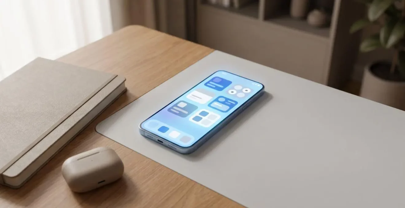
How to Stack 5 Widgets in One Space and Swipe Between Them Effortlessly?
The most valuable commodity on your home screen is space. The solution to displaying more information isn’t a larger screen or more pages; it’s increasing the density of information in a single, glanceable view. This is precisely what widget stacks are designed for. By stacking multiple widgets on top of each other, you can place your calendar, task list, weather, and news feed all within the same physical grid space, accessible with a simple swipe. This technique is the foundation of an uncluttered yet powerful information dashboard.
The process is straightforward: simply drag one widget of the same size on top of another. Your device will automatically create a stack. You can then add more widgets to this stack (up to a limit, typically around 10) and reorder them by long-pressing the stack and choosing ‘Edit Stack’. This is more than just an organisational trick; it’s a strategic act of widget choreography. For instance, you can create a “Morning Briefing” stack that combines weather, your first calendar event, and top news headlines. A “Work” stack might layer your project management tool, work email inbox, and a contacts widget for key colleagues.
This layering method allows for immense customisation that reflects your personal or professional priorities. As seen in one expert’s approach, a minimalist home screen can be achieved with just three stacked widgets: a glanceable task dashboard for priorities, a contacts widget for key people, and a personal-touch widget like photos. This setup dramatically reduces cognitive load by hiding secondary information until it’s actively requested via a swipe, keeping the primary view clean while ensuring critical data is always within thumb’s reach.
Automatic Smart Stack or Manual Widget Order: Which Shows the Right Info?
Once you’ve embraced stacking, the next strategic decision is one of control versus convenience: should you let the system decide what to show you, or should you maintain complete manual control? This is the core difference between a standard, manually-ordered stack and a “Smart Stack.” A Smart Stack goes a step further by attempting to predict your needs and automatically rotating the most relevant widget to the top. As Apple’s own documentation states, this is a sophisticated process.
Smart Stack uses on-device Siri intelligence to surface the right widget at the right time, determining which widget to show based on factors such as time, location, device activity, and more.
– Apple Developer Documentation, How to use Smart Stack widgets on iPhone and iPad
When it works, a Smart Stack feels like magic, showing your music controls when you connect headphones or your calendar just before a meeting. However, this “on-device intelligence” can sometimes be unpredictable, surfacing a news widget when you urgently need your task list. For mission-critical information, this lack of predictability can be a significant drawback. A manually ordered stack, by contrast, is completely predictable. Your task list is always at the top because you put it there. This reliability is essential for workflows that depend on muscle memory.
The optimal solution is not to choose one or the other, but to implement a hybrid approach. Use an automatic Smart Stack for discovery-oriented information where serendipity is welcome—like news, app suggestions, or photos. For your core productivity workflow, create a separate, manually-curated stack with “Smart Rotate” turned off. This gives you the best of both worlds: a predictable dashboard for what you need to see, and an intelligent assistant for what might be interesting to see.
Your Action Plan: The Hybrid Stack Strategy
- Create an automatic Smart Stack for discovery-oriented information (news, suggestions, app shortcuts) on your primary home screen.
- Build a separate manually-curated stack for mission-critical tasks by disabling ‘Smart Rotate’ in Edit Stack settings.
- Train the automatic stack by consistently swiping past irrelevant widgets and engaging with preferred ones.
- Link specific widgets to Focus Modes to override automatic rotation and force priority widgets to the top during Work or Personal modes.
- Review widget performance weekly and adjust the manual stack order based on actual usage patterns.
The Background Refresh Setting That Makes Widgets Drain 15% Battery Daily
The primary cost of a data-rich home screen is battery life. Every widget that displays dynamic information—weather, stocks, news, location—is a small but persistent drain on your device’s power. While a single static widget has almost no impact, a collection of poorly configured, high-refresh-rate widgets can easily consume a significant chunk of your daily battery. The main culprit is often a single, powerful setting: Background App Refresh. This setting is the master switch that allows apps to fetch content in the background, and it’s essential for widgets to function.
However, leaving this enabled for every app is a recipe for battery drain. Some widgets are far more demanding than others. A real-time stock ticker or a weather widget constantly updating your GPS location consumes exponentially more power than a simple calendar widget that only needs to sync occasionally. Disabling background refresh for non-essential apps can have a dramatic effect; independent tests from 2024 show a 10-25% improvement in battery life on heavy-use days just from being more selective. This isn’t about turning everything off, but about making deliberate choices.
A strategic audit of your widgets is necessary. Go to Settings > General > Background App Refresh and conduct a ruthless cull. Does your social media widget really need to refresh in the background? Probably not. Does your task manager need to sync? Absolutely. The table below provides a clear hierarchy of battery impact, allowing you to make informed decisions about which widgets justify their energy cost.
| Widget Type | Battery Impact | Refresh Mechanism | Recommendation |
|---|---|---|---|
| Weather with GPS | High (3-5%/day) | Real-time location + network fetch | Use only on Wi-Fi or limit to manual refresh |
| Real-time Stock Tickers | High (4-6%/day) | Continuous market data streaming | Set refresh interval to 15+ minutes |
| News Feed | Medium (2-3%/day) | Periodic content updates via push | Disable for non-essential sources |
| Calendar Events | Low (0.5-1%/day) | Local data with occasional sync | Safe to keep enabled |
| Static Notes/Photos | Minimal (<0.5%/day) | No background refresh needed | Ideal for battery conservation |
Which Widgets to Show Morning, Afternoon, and Evening for Context-Aware Info?
A truly intelligent home screen is not static; it’s a dynamic surface that adapts to your changing needs throughout the day. The concept of a single, all-purpose layout is flawed because your information needs at 7 AM are vastly different from those at 3 PM or 10 PM. The most advanced form of home screen design involves creating what is essentially a context-aware dashboard, using tools like Focus Modes and Shortcuts to automatically swap widgets or even entire home screen pages based on time, location, or activity.
This means curating specific widget stacks for different parts of your day. For example:
- The Morning Launchpad (7 AM – 9 AM): This stack is about planning and awareness. It should feature a weather widget, a “day view” of your calendar, your top three tasks for the day, and perhaps a commute time estimate. The goal is to get a full situational overview in a single glance.
- The Afternoon Dashboard (1 PM – 5 PM): This is your execution mode. The stack should prioritise communication and progress. A widget showing your unread email or Slack messages, a project progress tracker, and a quick-capture notes widget are ideal.
- The Evening Wind-Down (8 PM onwards): This stack should promote disconnection and preparation. It might include a widget for your reading list app, a meditation timer, a preview of tomorrow’s calendar, and a smart home control for your lights.
One user documented a powerful implementation of this, redesigning their home screen to align with daily goals. They created time-based configurations for morning, afternoon, and evening, completely removing social media from the home screen to create intentional friction. They further reinforced these states with specific Focus Modes and even different wallpapers to psychologically prime their brain for the task at hand. The result was a dramatic reduction in distraction and a significant increase in intentional, goal-oriented phone usage. This is the pinnacle of widget choreography—making the device work for your goals, not against them.
How to Create a Work Focus That Only Allows Calls from Your Boss and Family?
One of the most powerful applications of a context-aware system is the ability to rigorously defend your focus. Modern “Focus” or “Do Not Disturb” modes are more than just call silencers; they are sophisticated rule-based systems that can redefine who and what is allowed to access your attention. The key to an effective “Work Focus” is creating a precise digital barrier, allowing critical communications to pass through while blocking all other noise. This is achieved not by adding individuals one by one, but by leveraging Contact Groups.
The most robust way to configure this is to first organise your contacts. Create specific groups like ‘Work VIPs’ (your boss, direct reports) and ‘Inner Circle’ (immediate family, emergency contacts). When you set up your Work Focus, you can then specify that notifications are only allowed from these entire groups. This is far more efficient and scalable than managing a list of individuals. Any new team member added to the ‘Work VIPs’ group is automatically included in your Focus filter.
This same logic applies to apps. In your Work Focus settings, you should operate from a principle of “allow by exception.” Block everything by default, then explicitly permit the core tools essential for your job—your work email client, your team messaging app (like Slack or Teams), and your project manager. This act of subtraction is just as important as the act of addition. As one expert on the topic states, a key part of reducing distractions is turning off badges and non-essential alerts for any app that doesn’t align with your immediate priorities. Here’s how to set up this advanced configuration:
- Create Contact Groups in your phone’s contacts app: ‘Work VIPs’ and ‘Inner Circle’.
- Navigate to Settings > Focus > Work Focus and add both contact groups to ‘Allowed Notifications From People’.
- Select ‘Allowed Apps’ and permit only core work tools like Slack, Asana, and your work email client.
- Set up automation triggers, such as enabling the Focus mode when you arrive at your work address or when a calendar event labeled ‘Deep Work’ begins.
- Enable ‘Time Sensitive Notifications’ for critical apps as a fail-safe, allowing them to break through the Focus filter in an emergency.
Which Productivity App Category to Master First Before Adding Complexity?
The temptation when trying to get organised is to download a suite of powerful, all-in-one productivity apps like Notion or Obsidian. This is often a mistake. Adopting a complex system before you’ve mastered the fundamentals is like trying to run a marathon without learning to jog. The result is usually overwhelm and abandonment. The most successful approach is to build your “productivity stack” layer by layer, mastering one category of tool before adding the next. This is the Productivity Pyramid framework.
The foundation of this pyramid is the Task Manager. Before anything else, you need a single, trusted place to capture everything that needs to be done. This could be TickTick, Todoist, or a simple tool like Google Tasks. The goal is to get tasks out of your head and into a system. Master creating, organising, prioritising, and completing tasks in this one app. Don’t worry about scheduling or context yet; just master the “what.”
Only once capturing tasks is an ingrained habit should you move to the second layer: the Calendar. This tool manages the “when.” Now you can start integrating your system, for example, by dragging tasks from your task manager onto your calendar to time-block your day. This connects the “what” to a specific time slot. The third layer is the Note-Taking/Knowledge Base app (like Google Keep or Notion). This provides the “how” and “why.” It’s where you store project details, meeting notes, and reference material linked to your tasks. Trying to use a notes app as a task manager from day one often leads to a disorganised mess. By following this hierarchical approach, you build a robust and sustainable system incrementally.
- Foundation Layer (The ‘What’): Start with a dedicated Task Manager (e.g., TickTick, Todoist). Master capturing and completing tasks.
- Second Layer (The ‘When’): Integrate a Calendar app (e.g., Google Calendar). Learn to time-block and schedule the tasks you’ve captured.
- Third Layer (The ‘How’/’Why’): Add a Note-Taking app (e.g., Google Keep, Notion). Use it to store reference material related to your tasks and projects.
- Meta-Habit: Before any tool, establish a Weekly Review. Spend 30 minutes each week planning, assessing progress, and adjusting your system.
Key Takeaways
- Shift your mindset: Treat your home screen as a dynamic information dashboard, not a static app launcher.
- Embrace a hybrid strategy: Use automatic Smart Stacks for discovery and manually curated stacks for mission-critical, predictable workflows.
- Build your productivity system incrementally: Master a dedicated task manager first before adding the complexity of calendar scheduling and knowledge management.
Which 5 Apps Transform Your Phone from Distraction to Productivity Machine?
The question is not about which specific apps to install. The most effective way to transform your phone is to stop thinking about apps and start thinking about job roles. Instead of a random collection of tools, you need a small, dedicated team working for you directly from your home screen. By assigning a specific job to each widget or app, you create a system that serves your goals. A powerful productivity setup can be built around just five core roles, filled by apps of your choosing.
This “job role” framework forces you to think about function over features. Do you need a place to instantly capture thoughts before they disappear? That’s the “Gatekeeper” role. Do you need a persistent, visible list of your priorities for the day? That’s the “Director.” One strategist successfully implemented this system using widgets as the primary interface. They used a note-taking widget as the Gatekeeper, a task list widget as the Director, and crucially, they engaged in subtraction by removing all time-wasting apps from the home screen entirely. This created an environment that naturally guided them toward productive actions.
This approach elevates your home screen from a simple app menu to a functional command centre. By focusing on these essential roles, you can select the best app-and-widget combination for each job, creating a cohesive and powerful system that keeps you focused on what truly matters.
The table below outlines these five essential roles. Instead of recommending specific apps, it defines the function each one serves, allowing you to choose the tool that best fits your personal workflow. This framework, based on a concept highlighted by an analysis of minimal home screens, is the key to transforming your device.
| Job Role | Primary Function | Example Apps | Widget Priority |
|---|---|---|---|
| The Gatekeeper | Manages inputs, captures ideas instantly | Google Keep, Drafts, Quick Capture | High – needs home screen widget |
| The Director | Manages actions and priorities | TickTick, Todoist, Microsoft To Do | Critical – must be visible always |
| The Librarian | Manages knowledge and reference | Pocket, Notion, Evernote | Medium – accessible via stack |
| The Automator | Connects tools, reduces friction | iOS Shortcuts, Tasker, IFTTT | Low – works in background |
| The Guardian | Protects focus, limits distractions | Digital Wellbeing, Freedom, One Sec | Medium – awareness through widget |
Start today by auditing your home screen. Don’t add anything new. Instead, ask of every icon and widget: “What job does this do for me?” If the answer is “distract me” or “I don’t know,” remove it. Begin the process of subtraction, and you will have taken the first and most important step toward building a true productivity machine.